Role:
Product Designer Lead
Industry:
Finance
Duration:
26 weeks
Company
Farmtech is the strategic partner for the entire agricultural input supply chain that wants to request additional credit limits for its clients or finance the complete cycle of input commercialization. They simplify access to credit through a 100% digital platform without the need for real guarantees. Over R$ 22 billion has already been enabled, and more than 200,000 credit operations have been conducted.
source: https://www.linkedin.com/company/farmtechbr/about/
Project Context


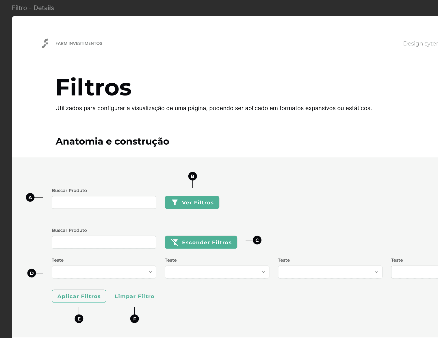
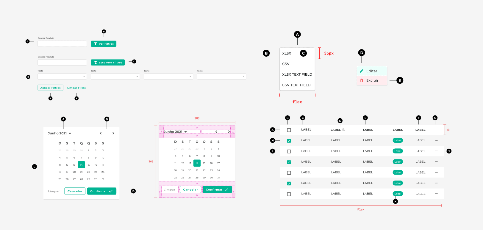
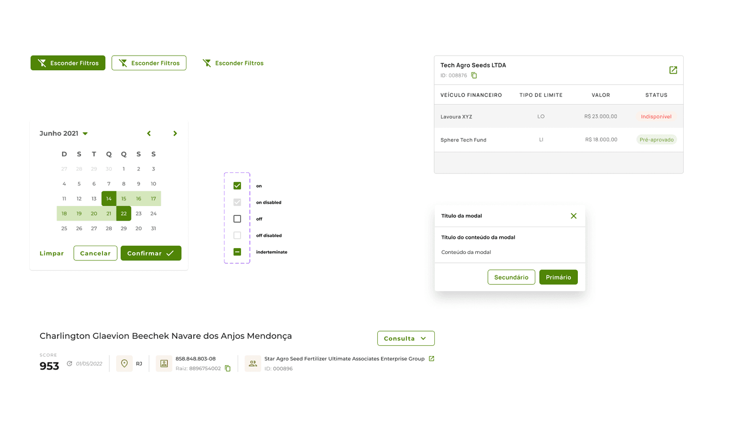
The Design System includes over 30 distinct components, ensuring that the platform maintains standardized patterns and behaviours across its various features and services.


In 2022, the Farmtech brand was renovated! The business was growing exponentially, and the need for a new brand was urged.

Project Specifications
Success Metrics
I focused on providing concrete metrics to ensure this project significantly impacts our platform.
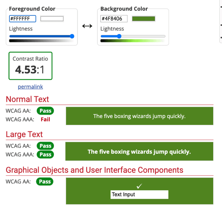
First, we aimed to enhance accessibility by ensuring that our design system meets AA compliance standards, as required for businesses in Brazil, based on WCAG guidelines.
In addition, we prioritized user experience. We identified and addressed interaction issues with our components, acknowledging that users might face challenges adapting to the new platform. To gauge the effectiveness of these improvements, we set the following goals:
1. After three months of implementation, users should complete actions 13% faster.
2. We aim to reduce support tickets related to the platform by external users usage by 30%.
These metrics will help us measure the project's success and its impact.
01 - Discover
The first step was to map and study some important parts of the project:
How many components do we have in the current design system? 32 components in total.
Create a matrix to understand the priority components vs how long it will take to rework them.
Do we have any other needs in our Design System? This is the time to create it! Creation of five more components.
Understand the new brand: study the new style guide.
After this research, some definitions for the project were ready:
Timeline: We could define a timeline of 3 months for the design team to finish the design system + platform redesign and 3 months more for the development team to update the storybook and the implementation.
Responsibilities: At this stage, we could further delineate the design team's responsibilities for each component, along with assigning the developers accountable for implementation.
02 - Define
After studying the style guide, the first step was to create a new digital style guide.
Starting with the colours, we could easily see that the new brand colours didn’t match our accessibility criteria.


By testing various tone variables in line with the brand style guide, we identified colors with strong potential for our digital palette. Following this discovery, we conducted further research to see how other companies approach their color strategies. We found that brands like Spotify employ a similar method, which reinforced our choice.

03 - Validation

04 - Execution
With all feedback collected, the first step was to update the components, both styles and documentation.
After the design system was ready, all the new projects were updated based on the new version - which took 2 months for the design team and after that, 3 more months to implement the entire platform.

Actions now stand out: Highlighted with a unique, clickable color for easy interaction.
Improved typography: Adjusted for better readability and clear visual hierarchy.
Consistent layout: A structured grid was designed and implemented for improved organization.
Updated support colors: Improved for better accessibility and clearer status indication.

Clearer main actions: Each screen now features only one primary button for better focus.
Improved components: Updated to adapt seamlessly across all breakpoints.
Organized sections: Content is now separated to avoid overwhelming users.
Results
This project has resulted in a more robust platform for both current and new users. By introducing a specific colour for interactive elements using a more contrasting colour scheme, and ensuring cohesive design elements, we observed significant improvements based on our metrics:
Users now complete tasks in under 20% of the time it previously took.
There has been a 15% decrease in the number of users returning with questions for our customer experience team.